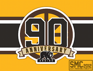
This is one of my few attempts at making logos. To tell the truth, i kind of suck at it but i think this came out decent. For it i tried to combine different eras of Boston's history. The spoked circle that they have used for may years, their famous black and gold and i even threw in the brown they use in their first ten years in the league.
Here is a jersey concept with my logo as a sholder patch. I saw a concept similar to this on a google search and thought it would look great as an anniversary jersey.
Sorry i haven't posted anything in a while. I'm having a hard time thinking up new ideas since it's the offseason in hockey. Maybe the next post will have a football concept since the preseason is starting!


No comments:
Post a Comment