Wednesday, September 25, 2013

AHL Redesign: Binghamton Senators


How's it going today guys?

I only have one redesign entry today. Been busy the last few days with going to the Big E in West Springfield, MA Thursday & Friday and also going to the Sylvania 300 in Loudon, NH (Yes, a NASCAR race) on Sunday along with editing photos from the race... So here ya go!

The Senators currently wear one of Reebok's "cookie cutter" uniforms. So I gave them uniforms that resemble Ottawa's alternate uniform.

--------------------------------------------------------------------------------

That's it for today!

-Scott


Thursday, September 19, 2013

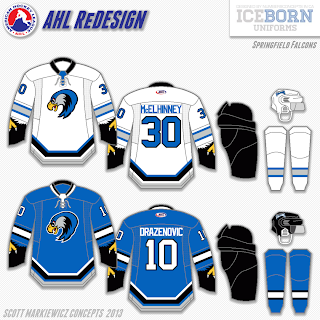
AHL Redesign: Devils, Wolf Pack & Falcons...Oh My!!!


Hey guys!

Here are the next three entries into my AHL redesign! Enjoy!


The Albany Devils currently wear their parent club's uniforms. So I wanted to change them enough to have their own look but also resemble their affiliate.

Over the last four years, the Hartford franchise has gone through two name changes. They went from the Wolf Pack to the CT Whale and back to the Wolf Pack this summer. The Pack will take the ice this season wearing the same uniforms they wore before the rebrand in 2010. Here, I returned them to their original look which a lot of Pack fans (including me) would like to see return full time or as an alternate.

Now for the Wolf Pack's I-91 rivals. I brought them back to the look they wore in 1994, their first season, which means the return of their original blue which Falcons fans would like to see make a comeback. The crest is the head of the Falcon used on their current uniforms which to me, is a modern version of their original logo.

EDIT:

Here's a Springfield Indians inspired logo idea I had for the Falcons.

------------------------------------------------------------------

That's it for today. I'm actually going to be in the Springfield area for the 2013 Easter States Exposition (The Big E as the locals call it) later today and tomorrow. Hope you guys enjoy your local fairs this fall!

-Scott


Friday, September 13, 2013

AHL Redesign: Heat & Phantoms


Hey guys!

Today, I officially start my "AHL Redesign Series", but first some jersey news...

This morning, Sportslogos.net reported that the Calgary Flames will be unveiling a new alternate jersey in the coming weeks. Click the highlighted link to read the story.

------------------------------------------------------------------------------

Now for the first two redesign entries...

The Abbotsford Heat currently wear Calgary Flames jerseys with yellow replaced by silver. Here, I simplified their look by removing the vertical stripes in the side panels and the piping. I also modified the arm stripes by giving them a slight curve and eliminated the flag shoulder patches. I personally didn't think there was any need for them..

Next season, the Adirondack Phantoms are slated to relocate to Allentown, PA and be re-branded the Lehigh Valley Phantoms. With that, I wanted to give them a fresh look. These uniforms are based off of the Don Mills Flyers of the Greater Toronto Hockey League.

------------------------------------------------------------------------------
That's if for now. Thanks for reading!

-Scott

Tuesday, September 10, 2013

AHL News & A New Concept Series!


Today, the American Hockey League announced that this season's All-Star Classic will be played in St. John's, Newfoundland, home to the Winnipeg Jets' farm team, the St. John's Ice Caps. The festivities will take place on February 11th & 12th with the game itself occurring on the 12th.The game will be played between the AHL All-Stars and Färjestad BK of the Swedish Hockey League! 
 "The 2014 AHL All-Star Classic will mark the first time ever that a Swedish Hockey League team has competed in North America. Founded in 1932 and based in the city of Karlstad, Sweden, Färjestad BK – led by team CEO Håkan Loob – is one of the most successful franchises in all of European hockey, playing in 19 league finals and winning nine Swedish league championships, including four since 2002." - theahl.com
 
-----------------------------------------------------------------------

To coincide today's announcement form the AHL, I am announcing a new "American Hockey League redesign" concept series! And to keep with the theme of today's post, here's the first entry into the series!

Here I went for a classic look with a modern feel, which I think the "IceBorn" template helps demonstrate it really well! In the AHL, the home teams wear white jerseys and the road teams wear dark jersey so I made the jerseys adaptable to which conference is the home team and which one is the road team by the work of shoulder patches. Here I made the Eastern Conference the home team and the Western Conference the road team.

----------------------------------------------------------------------- 
Hope you guys enjoyed today's post! And like the last concept series, I have no set days as to when entries will be posted so look out for post updates on social media!
Also, Happy NHL 14 release day!
-Scott

Monday, September 2, 2013

New Wild Jersey Review & My Sharks Fix


Photo: Minnesota Wild
Yesterday, after about a week of releasing teaser images, the Minnesota Wild finally unveiled their long awaited new road threads! My first reaction to the jersey was "YES!!!". I have ZERO complaints about this jersey! Everything about is screams hockey and very traditional, which I like, and modern at the same time. Also a good move by the Wild using true white as opposed to the wheat or "vintage white" that's used on their 3rd jersey. The square yoke fits perfectly and the use of their circle logo as a shoulder patch is great! It's better suited as a shoulder patch in my opinion. This jersey easily ranks up to one of my favorite in the league!

So after the unveiling, I'm sure a lot of Wild fans and most of us, if not all, jersey geeks thought about the Wild promoting their third jersey as their primary home jersey. I for one think it would be a great idea, but the exact jersey used now isn't exactly strong enough to match up with the new white jersey as a home jersey in my honest opinion. So I made a quick mockup of the changes I would make to bring it up to par.

The first big change right off the bat is the change from the wheat white in favor of true white. I just makes the jersey look cleaner. The second change is the addition of red to the collar & numbers to match the new road jersey. it's just enough red to contrast with the green but not overdoing it. I have also removed the wordmark in favor of the their primary logo as well as adding the shoulder patches and also switching the template to the same one used for the road jersey. I've also narrowed the thick stripes a little.

So as I've said, the Wild's new road jersey is definitely one of my favorite jerseys in the NHL..
------------------------------------------------------------------------

In the last post, albeit a hectic one, I reviewed the San Jose Sharks' new jerseys. Now here's how i would go about fixing them to make them more appealing..

Look, hem stripes! how hard was it to add them? They really don't add an more weight to the jersey which is why they eliminated them.. I've also fully removed orange from the jersey. Either have both orange stripes, or none at all! I know a lot of you are gonna hate me for keeping the chest number, but I actually like them. On a Sharks jersey that is.
------------------------------------------------------------------------

That's all I've got for today's post! Hope you enjoyed it!

-Scott