Showing posts with label AHL Redesign. Show all posts

Wednesday, January 8, 2014

AHL Redesign: Crunch, Stars, Comets & Penguins


Long time no post!

So the last month or so, I've been preoccupied with some things but now I have some time to actually sit down and finish the redesign! So let's jump right into today's entries!

-----------------------------------------------------------------------

 The defending AHL Eastern Conference Champion Crunch have basically worn the dame style uniform since the Reebok Edge uniform system was introduced into the league but with different color schemes with different affiliations (Columbus, Anaheim, Tampa Bay). Here i gave them similar uniforms to their current parent club, the Lightning, but added silver stripes.

This season, the Texas Stars came out with two different uniforms to replace the uniforms they've had since their inaugural season. Here, I took their new road jerseys and made a matching home set.

Here, I gave the Comets their own uniforms to set them a part from their parent club, the Canucks, but in a way that they still resemble them.

For the Penguins, I just wanted to try something different. Something that neither Pittsburgh or Wilkes-Barre/ Scranton have ever worn.

-----------------------------------------------------------------------

That's it for today! Sorry for the lack of posting lately and I hope to have the rest of the redesign entries in the next one or two posts!

-Scott


Wednesday, December 4, 2013

AHL Redesign: Sound Tigers, Checkers & Americans


Sorry for the delay, here are the next three in my AHL Redesign!

---------------------------------------------------------------------------------

 Not much change for the Sound Tigers. A new template pattern with altered arm striping to set them a part from their parent club, the Islanders.

 The Checkers went in the same direction with their new uniforms this year as the Hurricanes did. Except they added a black stripe to their road jersey. Here, I changed their road jersey to match their home.
The Americans are another one of the "untouchable" teams in the AHL. For this set, all I did was add collar laces and made the collar inserts red.

---------------------------------------------------------------------------------

That's it for today! Enjoy!

-Scott


Wednesday, November 20, 2013

AHL Redesign: Wolves And Milwaukee Admirals


What's going on guys? Here are the next two in my AHL redesign!

 --------------------------------------------------------------------

The Chicago Wolves have the most unique identity in the AHL. Their logo and jersey's haven't had and major changes in their existence (IHL & NHL), similar to the NHL's Original Six. So it's only fitting that have only made some small changes. I added collar laces and straightened out the hem stripes (They currently run along the hem). Other than that, they are exactly the same.

The Milwaukee Admirals have very Reebok-y uniforms. Here, I switched them to a more traditional design to go with their unique color scheme. The crest is an updated version of their 70's logo with the current color scheme and "Skeleton Head" logo.

--------------------------------------------------------------------


Thursday, November 7, 2013

AHL Redesign: P-Bruins & Rampage


Hey guys!

Let's jump right into the concept...

--------------------------------------------------------------------------------------------

Providence recently redesigned their uniforms for the 2013-14 season. To sum it up, I think they could have done better... Here's my fix

San Antonio wear a recolored version of the old "Buff-a-slug" jerseys which are a Reebok cookie cutter template. Here, I gave them a more simple jersey design.


--------------------------------------------------------------------------------------------
 
That's all for today!
 
-Scott


Sunday, October 27, 2013

AHL Redesign: Monsters & IceCaps


Hey! Hey! Hey! Sorry for the lack of updates. My computer has been giving me some issues that prevented me from doing concepts in a timely fashion. Anyway, let's get to the next two teams in my AHL Redesin!

-----------------------------------------------------------------------------------

The Monsters are the AHL affiliate of the Colorado Avalanche but have no resemblance to them, which is a good thing. But they wear Reebok "cookie cutter" uniforms. Here I went away from the cookie cutter look but also kept the uniforms somewhat the same. I did add hem stripes which make the uniforms look more complete.
The Monsters also have a new shoulder patch on their jerseys. Only thing is that I could not find it on any logo site. If anyone can help me locate where I can find it I will update the concept.

EDIT
I should have made clear that I am looking for a computer rendering of the patch. I'm horrible at trying to recreate logos so I want to try to avoid redrawing it if possible!

I believe that the IceCaps currently have one of the best looks in the AHL, even if they wear Winnipeg Jets jerseys. Which look good in their own right, don't get me wrong. But I took the double stripe element from their current set and made these based on those stripes.

-----------------------------------------------------------------------------------

That's it for today!

-Scott


Tuesday, October 15, 2013

AHL Redesign: Pirates, Sharks And Wolf Pack Jersey Reveal


What's happening guys?

Last night the Hartford Wolf Pack held a team meet and greet for their full and partial season ticket holders. All players were in attendance except J.T. Miller and Cam Talbot. We were told that they were suffering from a bug that was going around the locker room but were in fact on their way to New York to join the Rangers. The big clue was that Miller's equipment was absent from his locker during locker room tours. Anyway, during the event, the Wolf Pack unveiled a new third jesrey that will be worn on various nights this season.

 
Here is a photo i took at the event. At first glance we notice that it's red! The last time the Wolf Pack wore a red uniform was during their fifth anniversary season in 2002. All in all, this jersey looks to be a red version of their current home & road uniforms.

Here is a cleaner mockup I posted on twitter last night:
--------------------------------------------------------------------------

All I did for the Pirates was add hem stripes. Otherwise, the uniforms are exactly the same.

The Worcester Sharks currently wear the jerseys the San Jose Sharks wore before their redesign this off season. Here, I removed the orange and the shoulder yoke to give them a cleaner look. Something San Jose should have done.

--------------------------------------------------------------------------

That's if for today!

-Scott


Wednesday, September 25, 2013

AHL Redesign: Binghamton Senators


How's it going today guys?

I only have one redesign entry today. Been busy the last few days with going to the Big E in West Springfield, MA Thursday & Friday and also going to the Sylvania 300 in Loudon, NH (Yes, a NASCAR race) on Sunday along with editing photos from the race... So here ya go!

The Senators currently wear one of Reebok's "cookie cutter" uniforms. So I gave them uniforms that resemble Ottawa's alternate uniform.

--------------------------------------------------------------------------------

That's it for today!

-Scott


Thursday, September 19, 2013

AHL Redesign: Devils, Wolf Pack & Falcons...Oh My!!!


Hey guys!

Here are the next three entries into my AHL redesign! Enjoy!


The Albany Devils currently wear their parent club's uniforms. So I wanted to change them enough to have their own look but also resemble their affiliate.

Over the last four years, the Hartford franchise has gone through two name changes. They went from the Wolf Pack to the CT Whale and back to the Wolf Pack this summer. The Pack will take the ice this season wearing the same uniforms they wore before the rebrand in 2010. Here, I returned them to their original look which a lot of Pack fans (including me) would like to see return full time or as an alternate.

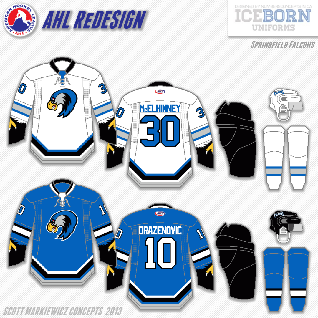
Now for the Wolf Pack's I-91 rivals. I brought them back to the look they wore in 1994, their first season, which means the return of their original blue which Falcons fans would like to see make a comeback. The crest is the head of the Falcon used on their current uniforms which to me, is a modern version of their original logo.

EDIT:

Here's a Springfield Indians inspired logo idea I had for the Falcons.

------------------------------------------------------------------

That's it for today. I'm actually going to be in the Springfield area for the 2013 Easter States Exposition (The Big E as the locals call it) later today and tomorrow. Hope you guys enjoy your local fairs this fall!

-Scott