Showing posts with label AHL. Show all posts

Sunday, October 6, 2013

AHL Redesign: Icehogs & Marlies


Hey guys! Here are the next two entries into my AHL redesign!

------------------------------------------------------------------------------


Currently, the Icehogs wear Blackhawks jerseys. Here, I kept the white jersey the same but added collar laces and promoted their alternate with collar laces added. I also removed the blue from the logo.

Last season, the Marlies introduced a throwback uniform to the old Toronto Malboros. Here, I used their primary logo on that set and made a matching dark uniform.

------------------------------------------------------------------------------

That's it for today!

-Scott

Friday, September 13, 2013

AHL Redesign: Heat & Phantoms


Hey guys!

Today, I officially start my "AHL Redesign Series", but first some jersey news...

This morning, Sportslogos.net reported that the Calgary Flames will be unveiling a new alternate jersey in the coming weeks. Click the highlighted link to read the story.

------------------------------------------------------------------------------

Now for the first two redesign entries...

The Abbotsford Heat currently wear Calgary Flames jerseys with yellow replaced by silver. Here, I simplified their look by removing the vertical stripes in the side panels and the piping. I also modified the arm stripes by giving them a slight curve and eliminated the flag shoulder patches. I personally didn't think there was any need for them..

Next season, the Adirondack Phantoms are slated to relocate to Allentown, PA and be re-branded the Lehigh Valley Phantoms. With that, I wanted to give them a fresh look. These uniforms are based off of the Don Mills Flyers of the Greater Toronto Hockey League.

------------------------------------------------------------------------------
That's if for now. Thanks for reading!

-Scott

Tuesday, September 10, 2013

AHL News & A New Concept Series!


Today, the American Hockey League announced that this season's All-Star Classic will be played in St. John's, Newfoundland, home to the Winnipeg Jets' farm team, the St. John's Ice Caps. The festivities will take place on February 11th & 12th with the game itself occurring on the 12th.The game will be played between the AHL All-Stars and Färjestad BK of the Swedish Hockey League! 
 "The 2014 AHL All-Star Classic will mark the first time ever that a Swedish Hockey League team has competed in North America. Founded in 1932 and based in the city of Karlstad, Sweden, Färjestad BK – led by team CEO Håkan Loob – is one of the most successful franchises in all of European hockey, playing in 19 league finals and winning nine Swedish league championships, including four since 2002." - theahl.com
 
-----------------------------------------------------------------------

To coincide today's announcement form the AHL, I am announcing a new "American Hockey League redesign" concept series! And to keep with the theme of today's post, here's the first entry into the series!

Here I went for a classic look with a modern feel, which I think the "IceBorn" template helps demonstrate it really well! In the AHL, the home teams wear white jerseys and the road teams wear dark jersey so I made the jerseys adaptable to which conference is the home team and which one is the road team by the work of shoulder patches. Here I made the Eastern Conference the home team and the Western Conference the road team.

----------------------------------------------------------------------- 
Hope you guys enjoyed today's post! And like the last concept series, I have no set days as to when entries will be posted so look out for post updates on social media!
Also, Happy NHL 14 release day!
-Scott

Friday, August 23, 2013

Sharks Review & Wolf Pack Revisited


What's happening everyone?

Since the Stars and Hurricanes jersey unveiling's earlier in the off-season, not much has happened jersey wise in the hockey world. But in the last week or so we've seen the AHL's Providence Bruins update their jersey lineup without a white home jersey but with a yellow one, and the San Jose Sharks finally unveiling their updated threads. Today, I will share my thoughts on the Sharks' new jerseys.

 ------------------------------------------------------------------------------

 Earlier in the week, the Sharks shared teaser videos on Instagram over a couple of days with the hashtag "#NewWave" to promote the jersey unveilling's. What they showed on those seconds long videos were the elimination of some orange and the elimination of the colored shoulder yoke. And what they showed was basically all there is to the new jerseys...


Diagram from the Sharks' Website
Not much to talk about here... Just that the jerseys look empty with the elimination of the hem stripes, ONE orange stripes on the arms and no shoulder yoke. They did add collar laces which I like. If I had to pick my favorite of the two, I would probably choose the white jersey..


------------------------------------------------------------------------------

Now a while back I posted a Hartford Wolf Pack concept with striping based off their sock striping that was used before being rebranded in 2010. Today I have another idea of what they should wear.

I merged two different eras into one set. The jersey design itself is an edgeified version of their inaugural jerseys, which were the Rangers' liberty jerseys with Wolf Pack logos, and the name/number font they used from 2008-09 until they were rebranded.

Here are full body mockups of the uniforms.
------------------------------------------------------------------------------
 
I apologize if the post looks a little crazy as I threw it together as I was writing it..
 
Well, that's it for today!
 
-Scott


Monday, May 27, 2013

Brampton Beast & Utica Flames


What's going on guys?

Not much has been going on since my last post in regards to the Hartford Wolf Pack, but a lot has happened in the Stanley Cup Playoffs. Which I rather not talk about, lol... But when it comes to jersey new for next season, the Dallas Stars accidentally (or intentionally?) leaked their new logos. I'm not gonna make a judgement on them until the uniforms are officially released next week. Also, on the same day as the Stars' uniform reveal, the Hurricanes are going to unveil new uniforms which are the first major brand update since the Hurricanes packed their bags to North Carolina from Hartford. With the teaser images they've released, I'm having a hard time picturing them...

Anyway, onto today's concepts!

--------------------------------------------------------------------------------------------------

 Here's a concept for the Central Hockey Leagues first Canadian team, the Brampton Beast.


Here's an idea I had for Calgary's AHL team. I have Calgary relocating the Abbotsford Heat to Utica, New York so the Canucks can move their newly acquired Peoria Rivermen (AHL) to Abbotsford.

I tried to give the Utica Flames their own look while still resembling their parent club.
--------------------------------------------------------------------------------------------------

That's it for today! I hope my American readers are enjoying your Memorial Day weekend!

-Scott

Tuesday, May 14, 2013

It's Official, The Pack Is Back!


What's going on guys?

Well, It's official! The Connecticut Whale have been re branded and will take the ice next season (13-14) as the Hartford Wolf Pack!


If any of you follow me on Twitter, you know by now that I am in favor of going back to the Wolf Pack brand. It's unique and has a winning tradition which sadly a lot of people here in Connecticut don't understand. Anyway, here is a link to the offical press release from the American Hockey League's website: http://theahl.com/the-pack-is-back-p183823

------------------------------------------------------------------------------------

The team has already begun to relaunch hartfordwolfpack.com. It's not much right now. Just a splash page with season ticket information for next season. The only thing I don't like is that it looks as if they will only be selling lower bowl seats and closing off the upper bowl at the XL Center next season. The last two and a half years, my seats have been in the upper bowl. Due to better sight lines (in my opinion) and not as crowded.

Along with the name change, the Wolf Pack's primary logo from 1997-2010 will return. It is still unsure if we will see the uniforms used from 2007 until the re brand to the Whale or a completely new set of uniforms.

(From Sportslogos.net)

I for one would not mind if they brought the old ones back or if they came out with a new set! But if they bring back the old ones, I think they should come out with an edge version of one of the Wolf Pack's inaugural season jerseys as an alternate. Witch were basically Rangers Liberty jerseys with the Pack's primary logo on them which were used until I believe the 02-03 or 03-04 season. You cal also see an idea I had for a new uniform set for the Pack in my last post!

Global Spectrum, the company who will run the day-to-day operations of the team next season will be holding a "town hall meeting" with season ticket holders to get them involved with creating marketing ideas.

------------------------------------------------------------------------------------

Anyway, that's all I have to share with you guys so far. If I find out anything else or if I have missed something, I will update this post and let you all know about the updated on Facebook/Twitter!

-Scott


Saturday, May 4, 2013

The Pack Is Back!


What's going on guys?

As you all have probably heard by now, the AHL's Connecticut Whale are expected to be 'un-branded' back to the Hartford Wolf Pack. The change comes 2 1/2 years after Howard Baldwin re-branded the team with hopes to lure the Whaler fans who have been hiding under a rock since 1997 and catch the eye of the NHL so Hartford can once again be an NHL city. But instead, they caught the NHL's eye with a different reason as you all might know by now.

When/if the official announcement comes, I'll have a post dedicated to all the specifics.

---------------------------------------------------------------------------------

Anyway, here's the main reason for today's post.

Here is my entry to HJC's Wolf Pack re-design contest currently being held. The striping pattern on the home & roads are based on the team's sock stripes until 2010. I also used their primary logo as opposed to the Rangers style word mark on the chest and brought back the 'Wolf-head submarine' alternate logo. On the alternate, I created a edited wolf-head logo for the crest (They used a similar logo as an alternate at one point).

---------------------------------------------------------------------------------
That's it for today!
Also, if anyone knows where I can get a crash course (a free one) on how to use Adobe Illustrator CS6, or would be willing to do one via email, it would be most appreciated!

-Scott

Monday, April 22, 2013

The Aeros Go Wild!


What's going on guys?

Today's post isn't a concepts post, but more of a news post.

Last week, the American Hockey League and the Minnesota Wild announced that they would be relocating their AHL team, the Houston Aeros, to Des Moines, Iowa for the 2013-14 season. The reason given for the move was that the Wild could not come to a lease agreement with the Aeros current home in Houston, TX. And today, the " NHL Wild" unveiled the "AHL Wild's" primary logo and home jersey.


Basically it's a white version of the Minnesota Wild's third jersey (which the Aeros used as a third this season). Anyone think it's a sign of what's to come for a new road uni for the big club?....We'll have to wait and see.

Also, anyone think it's weird that they did the unveiling while the Aeros are preparing for their run in the Calder Cup Playoffs?
--------------------------------------------------------------------------------

That's it for today!

-Scott

Tuesday, March 19, 2013

Play Ball!


Hey guys!

Well Spring Training is in full swing (Pun most definitely intended) and opening day is only a couple of weeks away! So today's post will be 95% baseball related. With that, posts are probably gonna be a little bit more scarce or might involve less concepts since I just got a job working concessions for the New Britain Rock Cats, the Eastern League (AA) affiliate of the Minnesota Twins! This post will also be involving the Rock Cats since I will share the Eastern League All Star Game logos (Hosted this season by the Rock Cats) and All Star Jersey concepts for the game.

-------------------------------------------------------------------------------------------------------------

 As I said, The Rock Cats will be hosting the Eastern League All Star Game at New Britain Stadium. This will be the second time the Rock Cats will be hosting it, with the first being in 2003. I for one am excited about it because I did not attend the on in 03' but will have the opportunity to work the game this year! When the time comes later this summer, I may have a post about it, but I most likely wont have pictures of my own to go along with it...

So here are the event logos for the game!


(Alternate Version)


Although the Rock Cats colors are red, black, gold, white, gray and tan, they included blue in the event logo to sort of give a nod to the franchises past.

Before being know as the Rock Cats/ Twins affiliate since 1995, they were the New Britain Red Sox and affiliated with, you guessed it!, the Boston Red Sox.

 -------------------------------------------------------------------------------------------------------------
 Here are the jersey concepts I came up with for the event...

Although these are concept jerseys for the event, they would not be worn during the actual game (Players regular uniforms will be worn). These jerseys would be worn for the All Star events the day before the game. The Eastern division would be the home team since the Rock Cats are in the East. Everything else is pretty much self explanatory.

-------------------------------------------------------------------------------------------------------------

Now here's the non-baseball part of the post...

The American Hockey League today posted this years Calder Cup Playoffs logo on Facebook & Twitter and I wanted to share it with all of you!


-------------------------------------------------------------------------------------------------------------

That about sums it up for today's post!

-Scott


Thursday, February 21, 2013

Are The Wolf Pack Returning To Hartford?


What's going on guys? 

Today's post isn't a concept post but more of some speculation regarding the American Hockey League franchise in Hartford, Connecticut. My backyard if you will...There has been a lot of doubt these past few months as to weather there will be professional hockey in Hartford next season with the Connecticut Whale's lease at the XL Center being up at the end of this season. The New York Rangers have said that they would like to keep the franchise in Hartford but lease talks have been halted due to the fact that the current lease to operate the building is up in August. AEG, the company that currently runs the XL Center, has operated the building since 2007 (Before that, Madison Square Garden Inc. was in control of the building since the Whalers packed up for North Carolina) was among three companies the Capital Region Development Authority were accepting bids from to operate the building come august. The other two Companies bidding were "The Bushnell", a local company headed by former Hartford Whaler, Bob Crawford and Global Spectrum. A company that is owned by Philadelphia Flyers owner, Ed Snyder. And after months of mulling over the bids, the CRDA finally chose a winner last week...The Winner was Global Spectrum.


Now that all the craziness is all set and done, now comes the time to find an keep/find an AHL franchise in Hartford. Reason being is that the arena management contract deal can't really be finalized until one is secured. Global Spectrum has until March 1st to keep the current AHL franchise or have one relocate or the deal will be voided.

MSG has expressed that they want to stay in Hartford because of the success of their prospects and the close proximity to NYC. Shortly after the arena deal was announced, there has been talks that a lease deal with the CT Whale is very close from being done.

Now here is the part about the name of the franchise...

If/when a lease deal with the current AHL franchise is finalized, one question that comes to mind is what name will we be rooting for come next season? When Howard Baldwin was run out of Hartford late this past off season, his group allowed AEG to use the CT Whale's name and logos. Now that AEG wont manage the arena or the team, Baldwin may not let GS use the CT Whale brand. If not. What will they be called? Well, a few days ago, MSG renewed the "hartfordwolfpack.com" domain. Renaming the team the Hartford Wolf Pack would seem like the easiest option due to the fact that MSG still owns the rights to the Wolf Pack name and logos.


So hopefully sooner, rather than later, a decision will be made so Hartford Hockey fans can have a name to root for.

---------------------------------------------------------------------------------------------------

I'm sure this story might not make sense to some of you because I am not great at writing thing like this. So, if you have any questions or need any clarifications, feel free to leave a comment and I will gladly answer!

-Scott

Friday, January 25, 2013

Tweaking the Rangers & Outdoor Classic


So the NHL season is in full swing after a long lockout and I bet you guys have watched a game or two on TV or have gotten to a game. Anyway, today's post consists of some minor tweaks to the Rangers' uniform set and my entry into HJC's AHL Outdoor Classic (Grand Rapids vs. Toronto) comp. And without further delay, here they are!

-----------------------------------------------------------------------------------------------------

It's sacrilegious to mess with an original six teams look so I mad some minor changes. Mainly, the template of the home jersey to match the template of the road jersey, I replaced the "RANGERS" word mark with "NEW YORK" and also altered the striping on the 3rd jersey and have different pants to go with it. I'm not too crazy about the changes, but some fans would like to see the change.


And here's my HJC contest entry!

 -Scott


Friday, January 11, 2013

Binghamton Senators Specialty Jersey

So the NHL is going to have a season after all! The NHL BOG have ratified the new CBA and now it's time for the players to do the same...From what I'm hearing, the Rangers are opening up in Boston on the 19th and will have their home opener the next night against Pittsburgh. And already the Rangers have been labeled the favorites to win the cup. I think it's too early for predictions for the cup, and with a shortened season, there is a lot of uncertainty. Anyway, I have only one concept to share today and it is my entry to HJC's Binghamton Senators Specialty Jersey contest...


 ------------------------------------------------------------------------------------------------------------------------

It also appears that HJC is down again for the same reason as before. Let's hope Ryan can figure something out to keep the blog going!

-Scott


Tuesday, January 1, 2013

My Top 10 AHL Logos!


 What's going on guys? Hope all of you have made your New Year's resolutions and are ready to start with a clean slate. For the first post for 2013, I decided to do my top 10 American Hockey League logos of all time. I chose the AHL because I follow the league more closely than any other due to the fact that Connecticut Whale are in my backyard. And to tell the truth, the Whale's logo didn't make it on my list...So here are my Top 10 AHL logos! Enjoy!

 ---------------------------------------------------------------------------------------------------------------------------------

10. Wilkes-Barre/Scranton Penguins
The WBS Penguins could have easily gone with an altered Pittsburgh Penguins logo, but they didn't. I like how they put their own twist on the "Skating Penguin" logo. I also like how they incorporated red into their color pallet. Instead of just going with black & vegas gold.

9. Milwaukee Admirals
A lot of people don't like Milwaukee's logo due to the fact that it's one of the most "cartoonish" logos in the AHL, I don't think that at all! They could have went with an updated version of their IHL logo, which they did for a few years, but got really unique with this one. It also made my list because of their colors. They are one of the few teams that can pull off having ice blue.

8. Grand Rapids Griffins
 It's a freaking Griffin!!!...That about sums it up...

7. Rockford IceHogs
I'm probably gonna get some looks for this one...Normally when a team puts "Ice" in their name, it's usually a bad omen for their logo. I like how the pig or "hog" is biting the hockey stick as opposed to skating with it.

6. Toronto Marlies
Again, the Marlies could have gone with an altered Maple Leafs logo, but went their own way with it. I just wish they would have gone their own way with their uniforms. To be honest, I actually liked their dog logo alternate from a few years ago.

5. Bridgeport Sound Tigers
Here, I kind of hate myself for putting the Sound Tigers logo on my list. Due to the fact that they and the CT Whale/Wolf Pack are in-state/division rivals. But they have one of the nicer logos in the league. I think they pull off their colors and uniforms better than the Islanders do.

4. Hershey Bears (New)
It's fitting that the most storied franchise in the AHL makes it high on my list...But when they re-branded this past off-season and brought back the"chocolate" from the red they've been using for some time, they hit the nail on the head. Their logos are perfect and so are the uniforms.

3. Hartford Wolf Pack
Now here's a bit of my bias on this list. This logo was one of the best in the league. But then Howard Baldwin returned to Hartford just before the 2010-11 season and tried to brainwash everyone that the Whalers were back. If the Whale get a new lease, I hope they have a retro night...

2. Manitoba Moose
The Moose...Great logo, great colors. And the reason Winnipeg has an NHL team again. I wish True North would have went with this instead of bringing back the Jets name.

1. Charlotte Checkers
This could technically be another bias on the list. Before the Checkers made the move to the AHL three years ago, they were the Rangers' ECHL affiliate and adopted this logo their last season in the "E".

 ---------------------------------------------------------------------------------------

Honorable Mentions

 Hamilton Bulldogs

 New Haven Nighthawks

 Oklahoma City Barons


Rochester Americans
 
Syracuse Crunch


Saturday, October 6, 2012

Black & Blue

Another week into the lockout and now the first two weeks of the NHL season have been cancelled. Luckily the lockout doesn't affect the AHL. The Rangers' "Blueshirts United" blog is streaming the CT Whale- Adirondak Phantoms game at 5:00pm eastern today so I'm gonna jump right into today's concepts which include the colors blue and black and two more from my ECHL redesign. Enjoy!


This is a direct transfer of what the Gladiators wear now to the Reebok EDGE system.

The Steelheads current uniforms are very unique. But, are very difficult to pull off in the EDGE system. So I thought a simple template would work with the color scheme. What do you guys think?

This concept was going to be my entry to the Blades' jersey contest that is currently being held. But, I don't think it's original enough to win. Suggestions would be greatly appreciated on this concept or for a new one.

To finish off the post, this IceHogs concept is based off a special event jersey they wore a cuple of years ago. I saw a similar modified logo for Rockford on HJC a while back but I can't remember who did it.

----------------------------------------------------------------------------------------------------------------------------------------

Thanks for taking time to read today's post, Enjoy!

Saturday, September 15, 2012

Possible NHL13 Jersy Leaks and Some Concepts Too

Hey guys! So yesterday I finally got my hands on NHL13 and while looking at the jersey combos for the AHL teams I stumbled upon some jerseys i've never seen before and here they are:


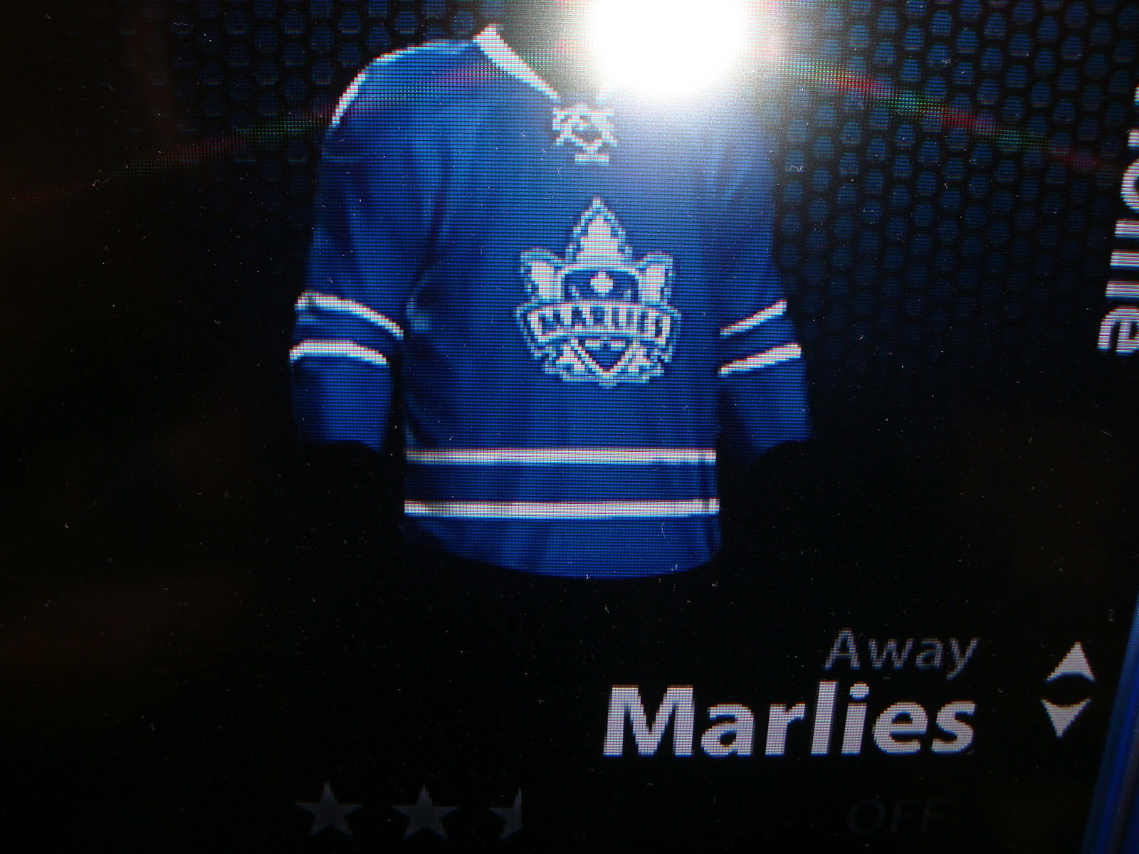
As you can see, the Springfield Falcons, Toronto Marlies and the Worchester Sharks seem to have new jerseys for this coming season. The Falcons are using a jersey similar to the road uniform of the Tri-City Americans(WHL) with their Springfield Indians inspired alternate logo that they have been using as their center ice logo the last two seasons. While the Marlies and the Sharks are going with the uniforms of their parent clubs. In fact, sportslogos.net confirmed on their twitter page this week that the Marlies will have new jerseys this year. So maybe these are them? I guess we will find out when these teams open their seasons on October 12th.
-------------------------------------------------------------------------------------------------------------------------------------------
Ok, now onto a cuple of concepts...
 
 
New York Rangers Concept
 
For some reason the other day and idea popped into my head with the Rangers' liberty logo on the Kitchener Rangers' alternate. All I have to say is that it looked better in my head...
 
Sarnia Sting Concept
 
Here I added hem stripes to the Sting's alternate from the past two seasons and made a matching home white to make a new set for them.