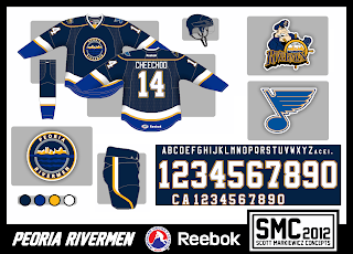
Just gonna jump right into todays concepts...
For the Steelheads (formerly the St. Michael's Majors), I gave them similar uniforms to the Toronto Maple Leafs. Since they play in the Toronto area, but added contrasting sholder yokes to sort of seperate them from the Leafs.
EDIT-7/27/12: The Steelheads unveiled their uniforms today! Check them out Here.
Here is my updated guess as to what I think the Syracuse Crunch will look like when they take the ice in October. They are basically Lightning uniforms but with silver trim in the arm and hem stripes.
I also just wanted to add that I am not going to finnish my Federal Hockey League redesign due to team changes this offseason. But I will reboot it when the season gets under way with new concepts.
AHL Redesign Progress
Tuesday, July 24, 2012
Saturday, July 14, 2012
Contest Entries
As some of you know, the Peoria Rivermen (AHL) and the Ontario Reign (ECHL) are having jersey design contests. Here are my four (4) design entries for the Rivermen and my one (1) entry for the Reign. I'm not going to comment on these but feel free to leave comments of your own!
Rivermen Entry #1
Rivermen Entry #2
Rivremen Entry #4
Reign Entry
Feel free to comment!
Monday, July 9, 2012
Flaming Penguins
Here I gave the Flames a simple hem stripe pattern. Otherwise, the uniform is pretty much the same.
For this Penguins concept I took their AHL affiliate's alternate uniform from this past season (which was a Pittsburgh design in the 80's and 90's but with vegas gold) and promoted it to Pittsburgh and made a matching road uniform. I also updated their "Robo Penguin" logo and used it as a sholder patch. Here is what the logo currently looks like.
For this Penguins concept I took their AHL affiliate's alternate uniform from this past season (which was a Pittsburgh design in the 80's and 90's but with vegas gold) and promoted it to Pittsburgh and made a matching road uniform. I also updated their "Robo Penguin" logo and used it as a sholder patch. Here is what the logo currently looks like.
Monday, July 2, 2012
Quebec & Syracuse
A few days ago I posted a guess as to what I thought the Syracuse Crunch would look like when they take the ice this coming season. Well, my guess was waaay off. The Crunch released their new logo today and here it is:
Crunchman returns! Shortly after my guess was posted, on Twitter, someone from the Crunch tweeted that they will be digging up the past with their new logo. And well, they sure did. They updated their origional logo that was used from 94'-99' and you can see it here.
For this Nordiques concept, I use elements from their past with a modern look to those elements. I used a darker blue and replaced the red with gray. I also moved the signature fleur de lis to the arms and are intended to be sublimated into the fabric of the jersey.
Subscribe to:
Comments (Atom)


